Poster Two Process - Thoughts
- Mackenzie Alderson

- Apr 8, 2020
- 3 min read
Updated: Apr 9, 2020
Theme: movie poster
Guidelines: apply principles of colour theory, include textual elements (e.g. movie title, director) considering organisational principles of typography and carefully think about signifier and signified.
Technique: Photoshop

Living the Good life
Attitude, Gratitude, Love-
Living in the now
- Cynthia Sageleaf (Sageleaf.C. 01/22/2018)
The process of creating a movie poster was far more complicated than expected. I began my process in the tutorial class where we were first tasked to experiment with possible film names, many names based on the Haiku came to mind, however, Mind Games really stuck because often I am someone to is hit by this idea of your mind playing tricks on you. I am often a worrier and find myself easily panicked. However, when I remind myself that actually there is nothing to worry about, I become calm and realise that was just my mind playing tricks on me! I think because I found the title so relatable was why the movie title 'Mind Games' really stuck.
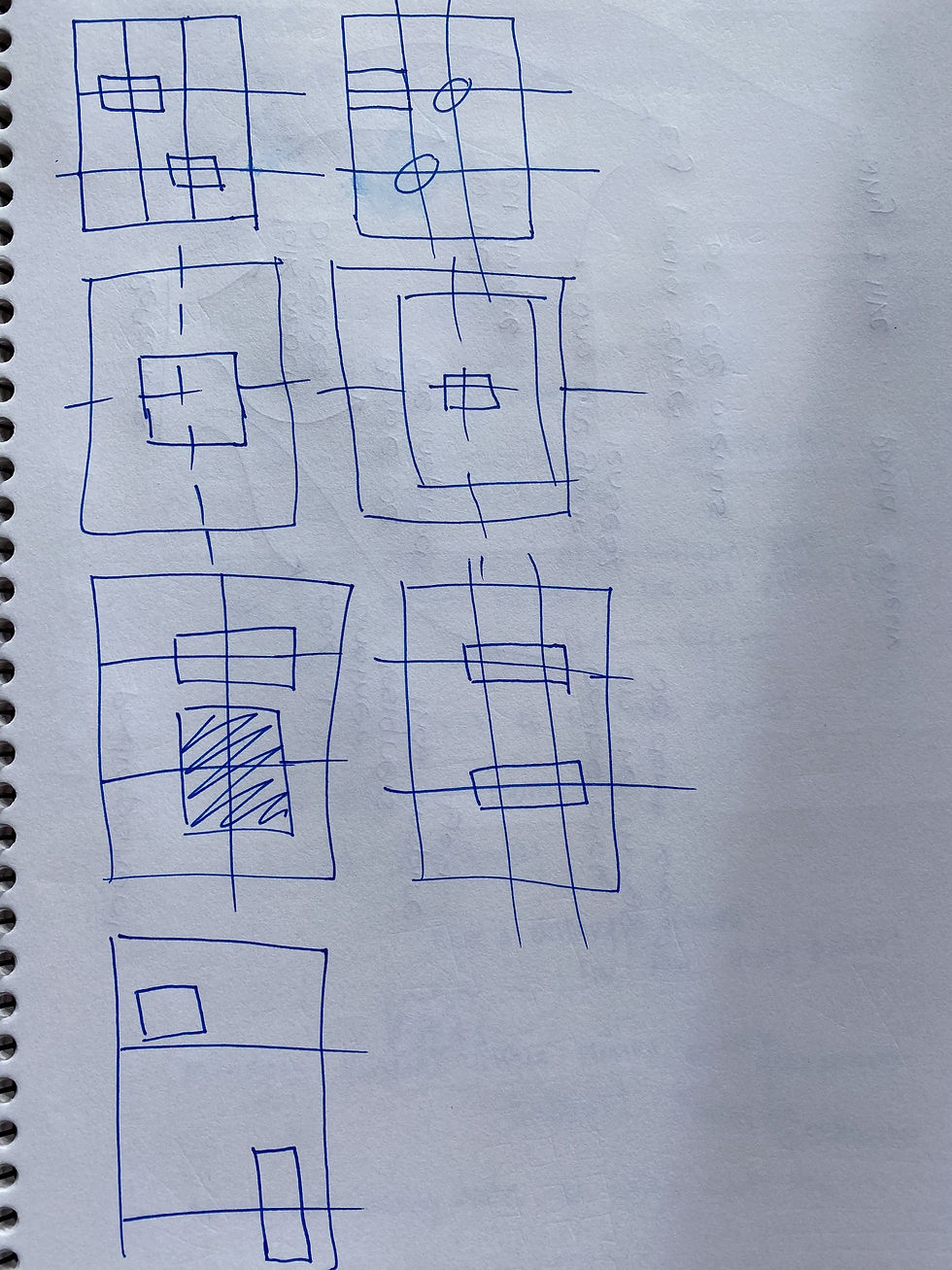
It was really interesting in the tutorial to go through the process of forgetting what the actual movie content was going to be and just brainstorming some different poster wireframes. This really helped me right from the beginning start thinking about really understanding where and why I was going to place each element on my poster.
These are some of my rough initial thought processes...


This was my first time using photoshop, so I spent a lot of time experimenting with different brush textures and effects.
In order to create my poster, I began using a simple blue background, I chose this background colour because this bright blue colour is often associated with the mind. I then added the silhouette. The silhouette is a side profile of myself that I had cut out and have on my wall, I took a photo of the image and then used the brush tool on photoshop to make it my own. I then drew using the brush tool the outline of a brain.
For my typography, I really wanted futuristic fonts that really brought the whole idea of the movie together. I chose the Blanka font for the title because it had a robotic, dystopian feel to it, which is what I wanted to create. I wanted the person looking at the movie poster, really wanting to go and see the film. I then chose the retro gaming font, because it really emphasised the idea of a game and suited the theme. I found after adding these, that the movie poster still felt blank, so I thought I would add some sort of setting so that potential viewers knew where the movie would take place, I felt that was important because viewers like to think that they know what they are in for and build some suspense.
I then wanted to make the girl transparent so that the viewer could feel like they could see right through the women, they knew what she was about, this was also to create suspense.
I then trialled adding different movie awards and ferns but liked the symmetrical balance of the poster, so decided to keep the alignment central.
This is my poster before my final poster...

I used high saturation colours in order to make the poster pop and make a statement. I wanted the poster to be eye-catching, to grab the potential film viewers attention. I chose to have complementary colours, so colours that are on opposite sides of the colour wheel. This was the bright blue and the peachy pink, to create contrast, to create more drama.
I also wanted to focus in closely on the sign, the signifier and the signified. My sign being the brain, which I felt is not only the keeper of the mind but the controller of our whole body, which is similar to a gaming controller, which is the controller of the whole gaming system. As well as incorporating alliance into my poster. I want the brain to be the first thing you look at, which is why I chose the colour pink on the black.
In order to create more depth, I added a different hue of blue at the top of the poster, using the pen on an iPad in photoshop, I used the watercolour pen and only pressed lightly, I then added the movie credits down the bottom to give it a more authentic movie poster feeling.
This is how my final poster came to be!


Comments